Creating Branding for a New Ice Cream Shop
Duration: 4 Months
Team Members: Sarah Carleton
My Role: I am the designer of this project and worked on the ideation, organization, prototyping, and development of the brand and prototype.
Problem: The problem is that there often aren't healthier ice cream shops that are still enticing to a broad audience. The goal was to create likable and friendly branding that evokes health-conscious undertones while still having a sense of wonder for a new ice cream company.
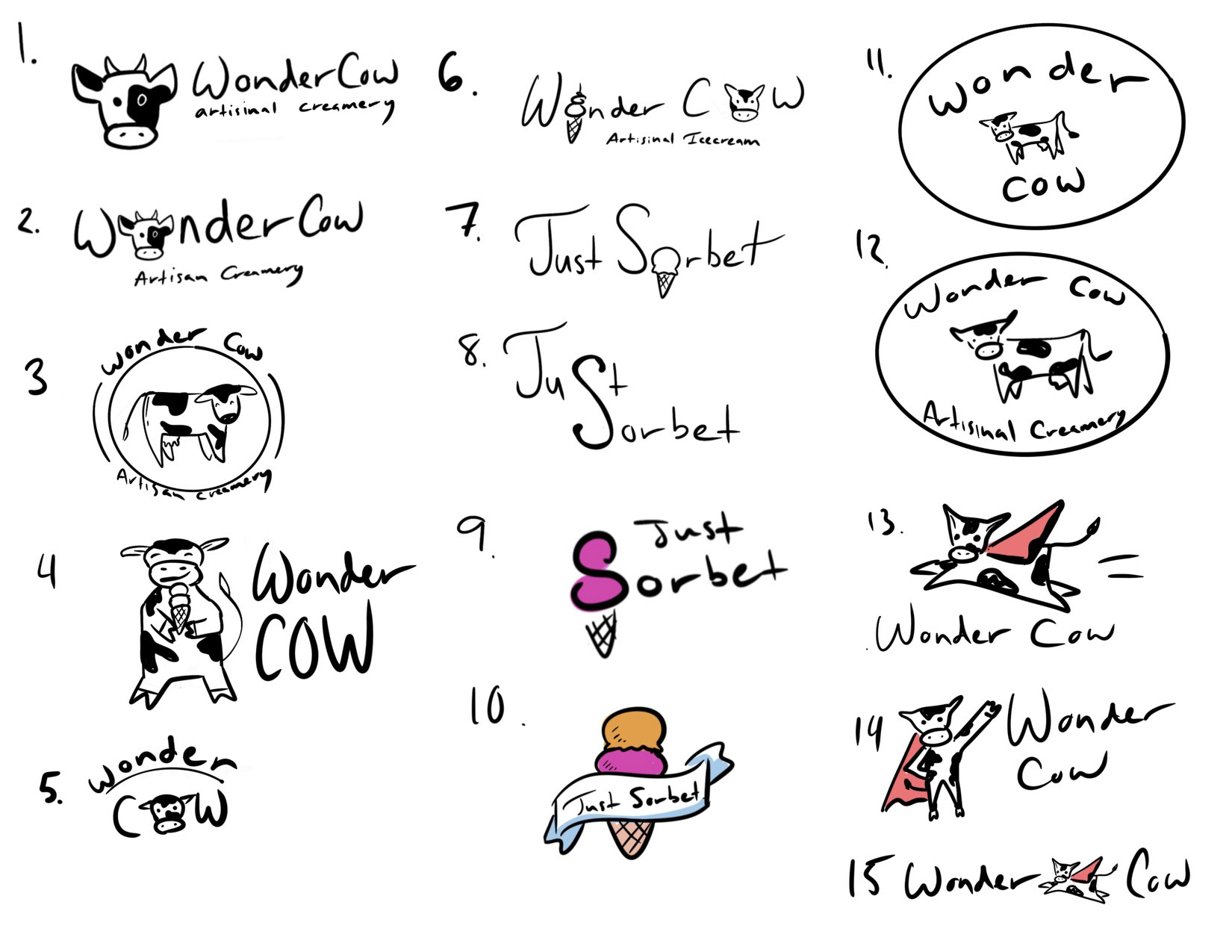
I started with lots of thumbnail sketches, as seen here, to develop my ideas and map out design concepts
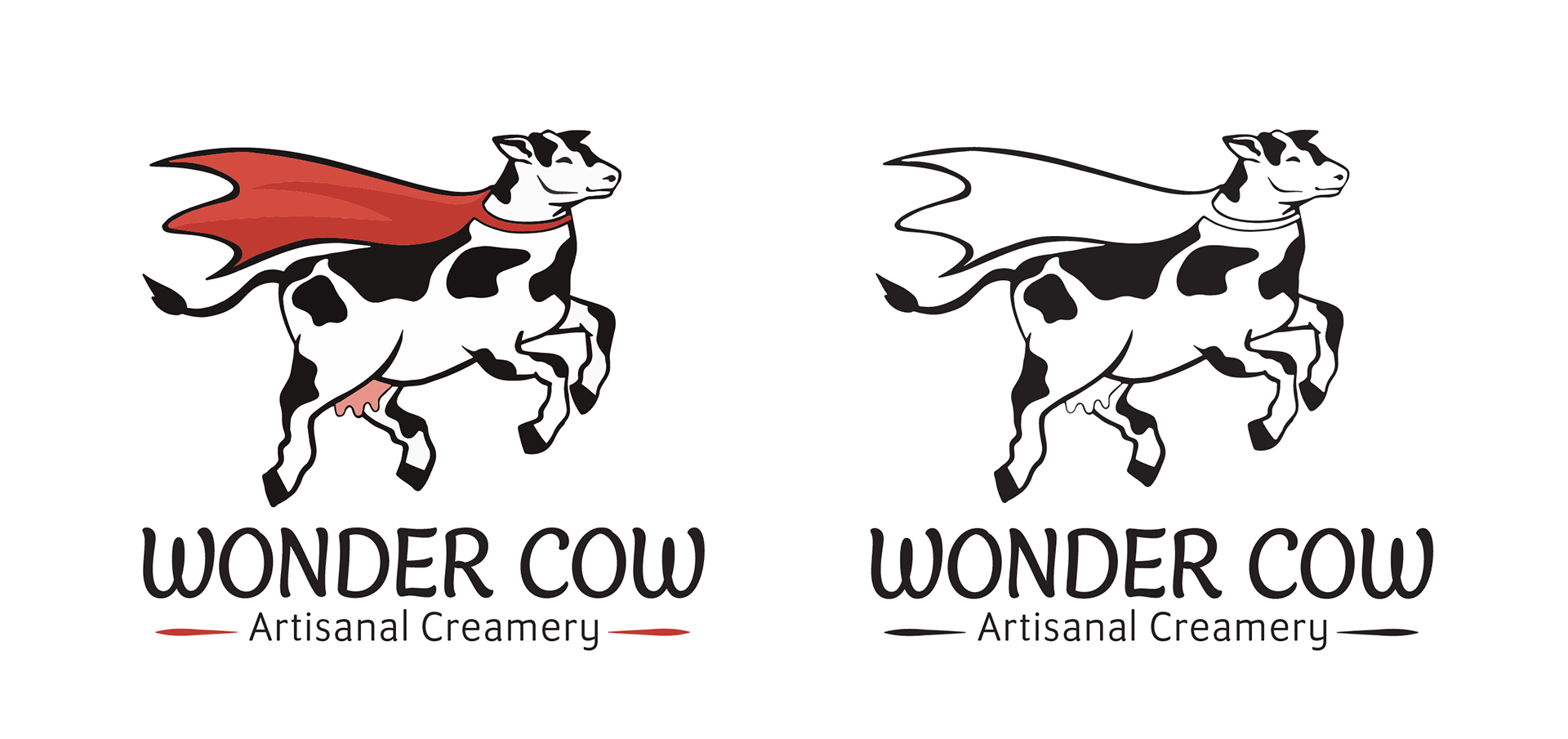
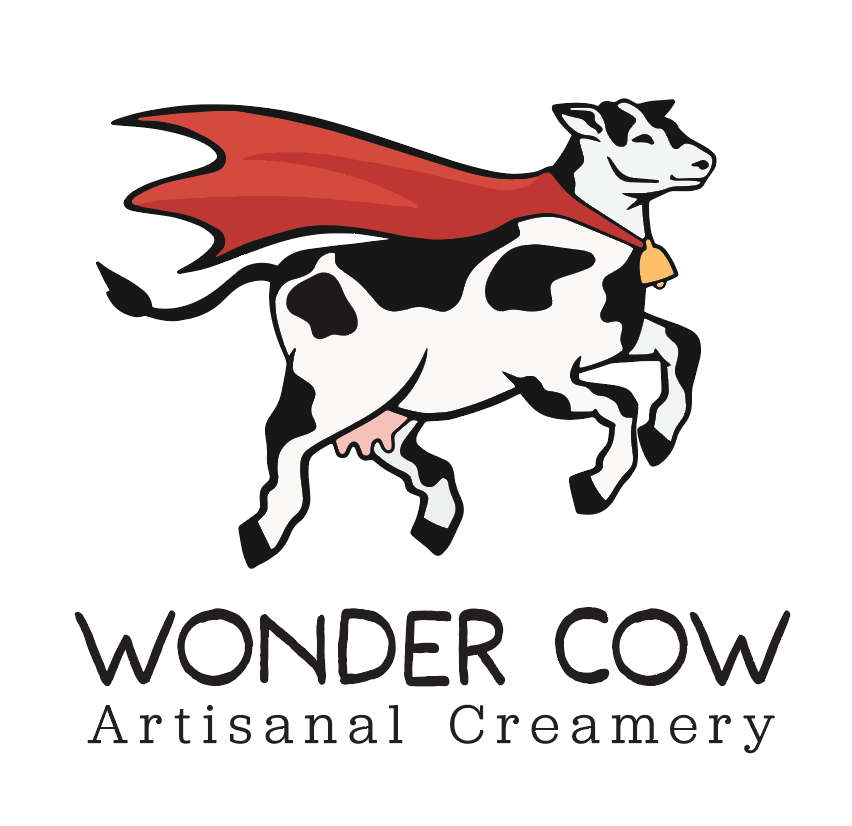
Solution: Wonder Cow Artisanal Creamery aims to be your go-to for indulgent yet health-conscious ice cream. Every scoop serves both flavor and well-being, tailored for parents and children alike. I went about this by making a fun logo containing a flying cow and verbiage such as "artisanal" to highlight the health elements. The colors are intended to draw you in, with red being a focal point.

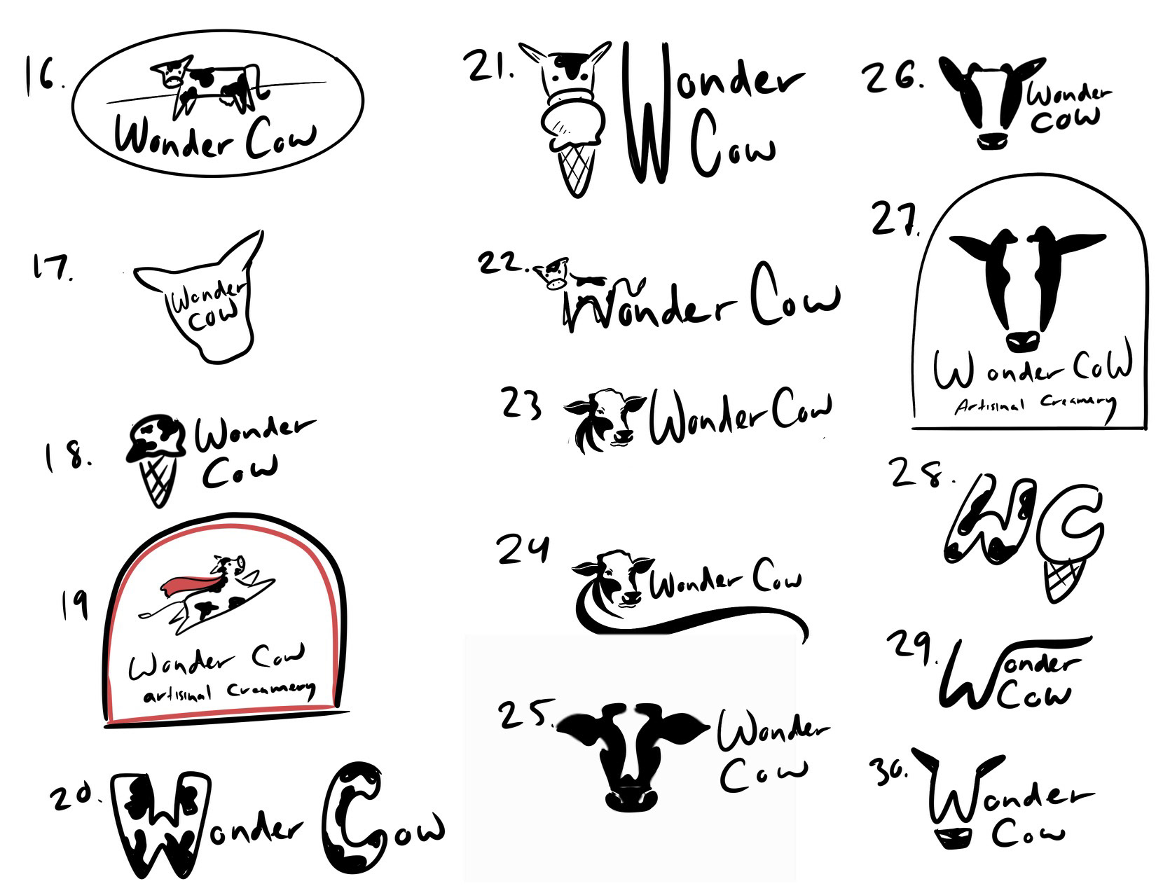
These are some slightly more refined versions of a few initial concepts. I focused on the name "Wonder Cow" here and liked the idea of including either a flying cow or ice cream imagery within the cow shape.
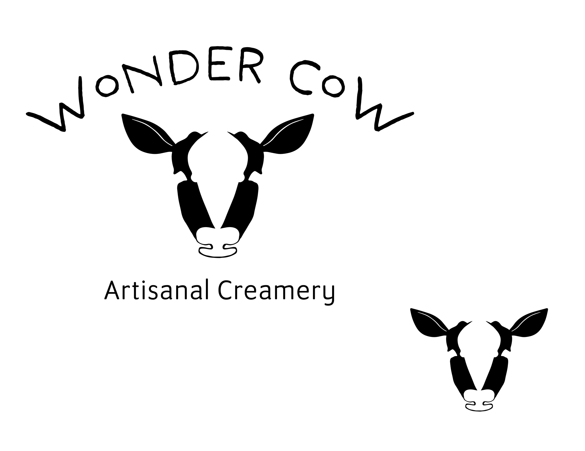
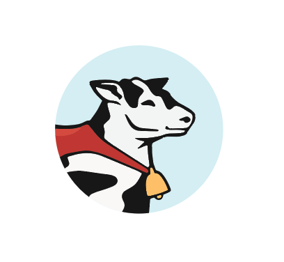
This was the initial design that I began to work with. At this point, I believed that this was the final design for the brand.
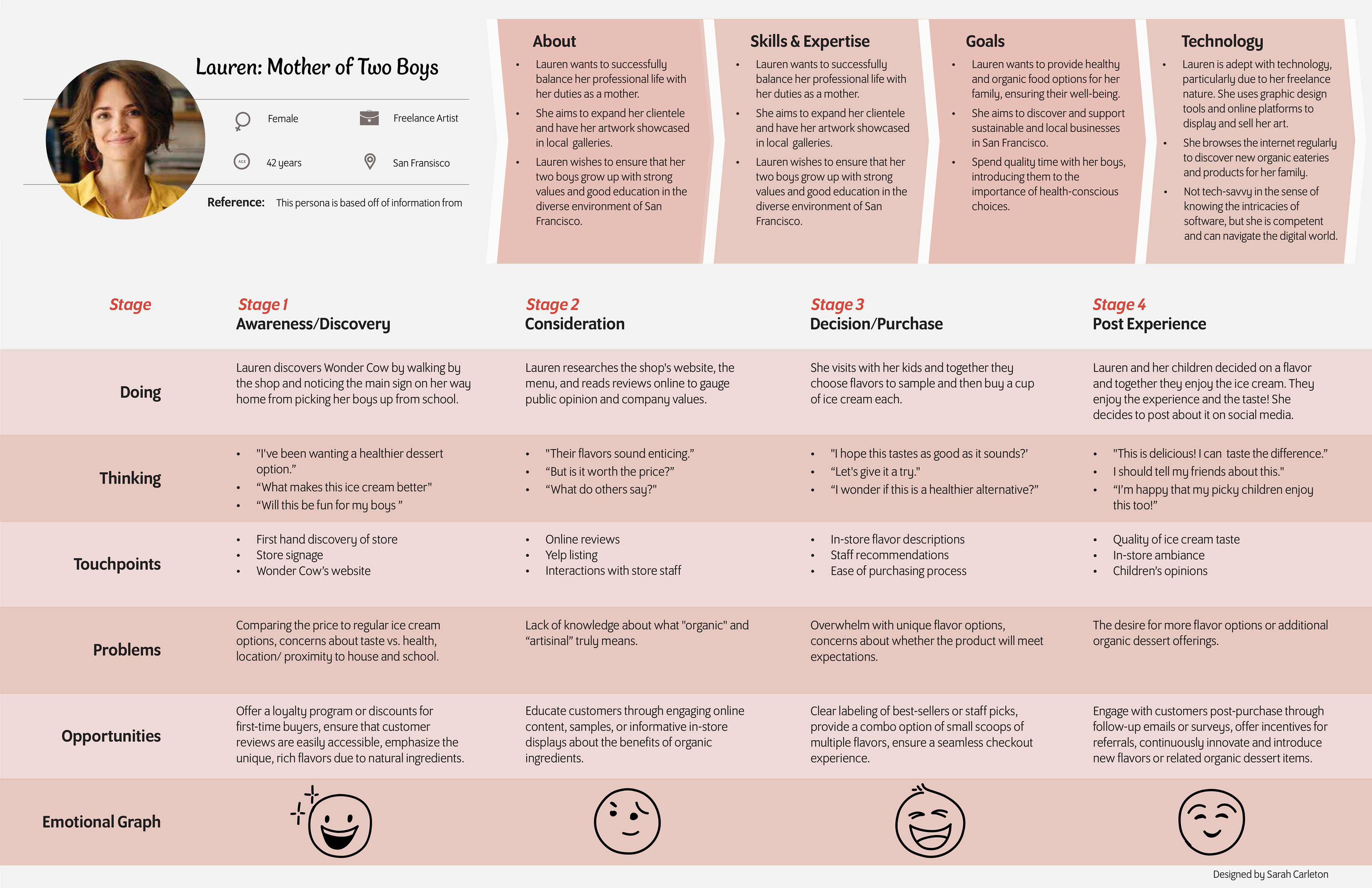
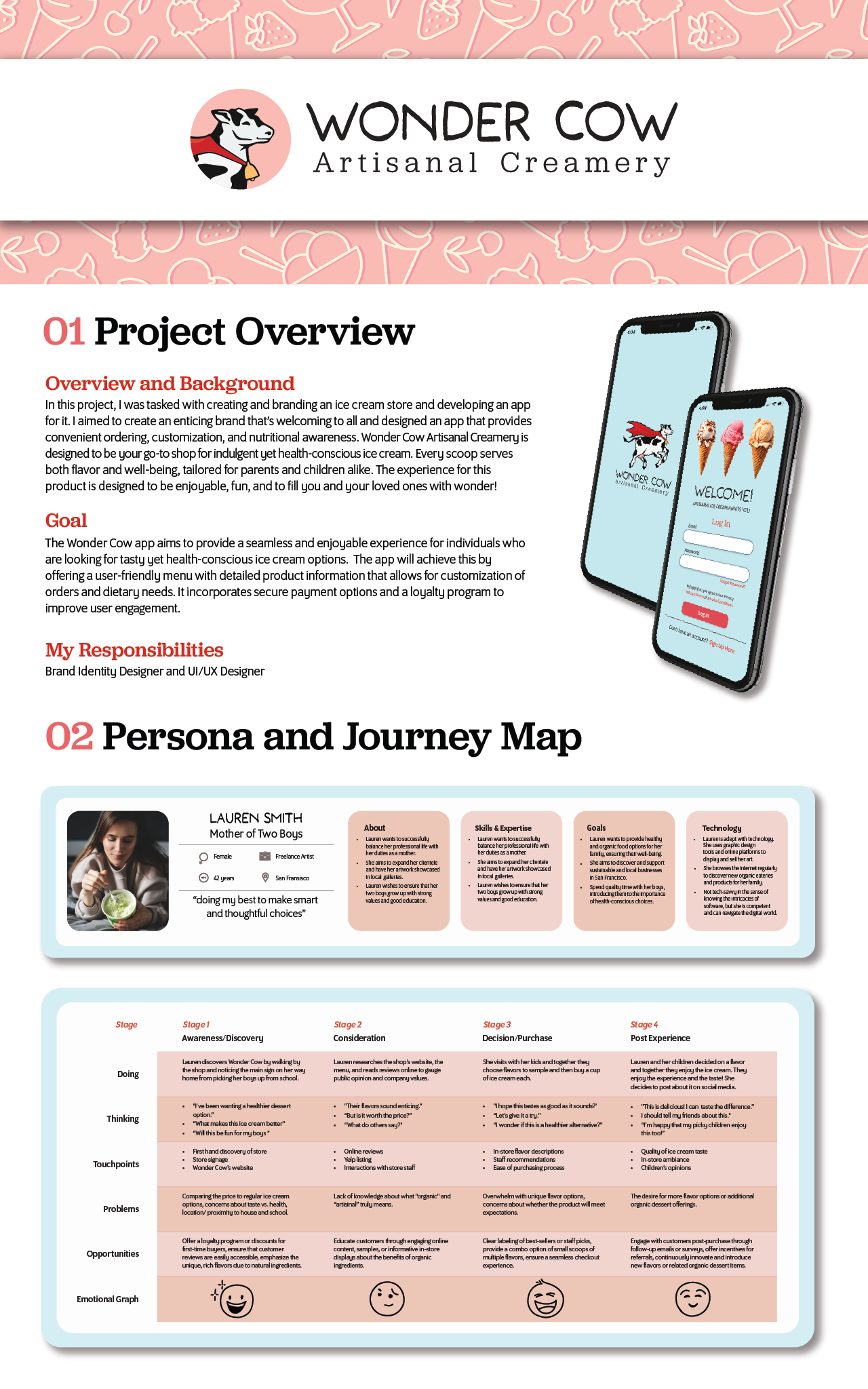
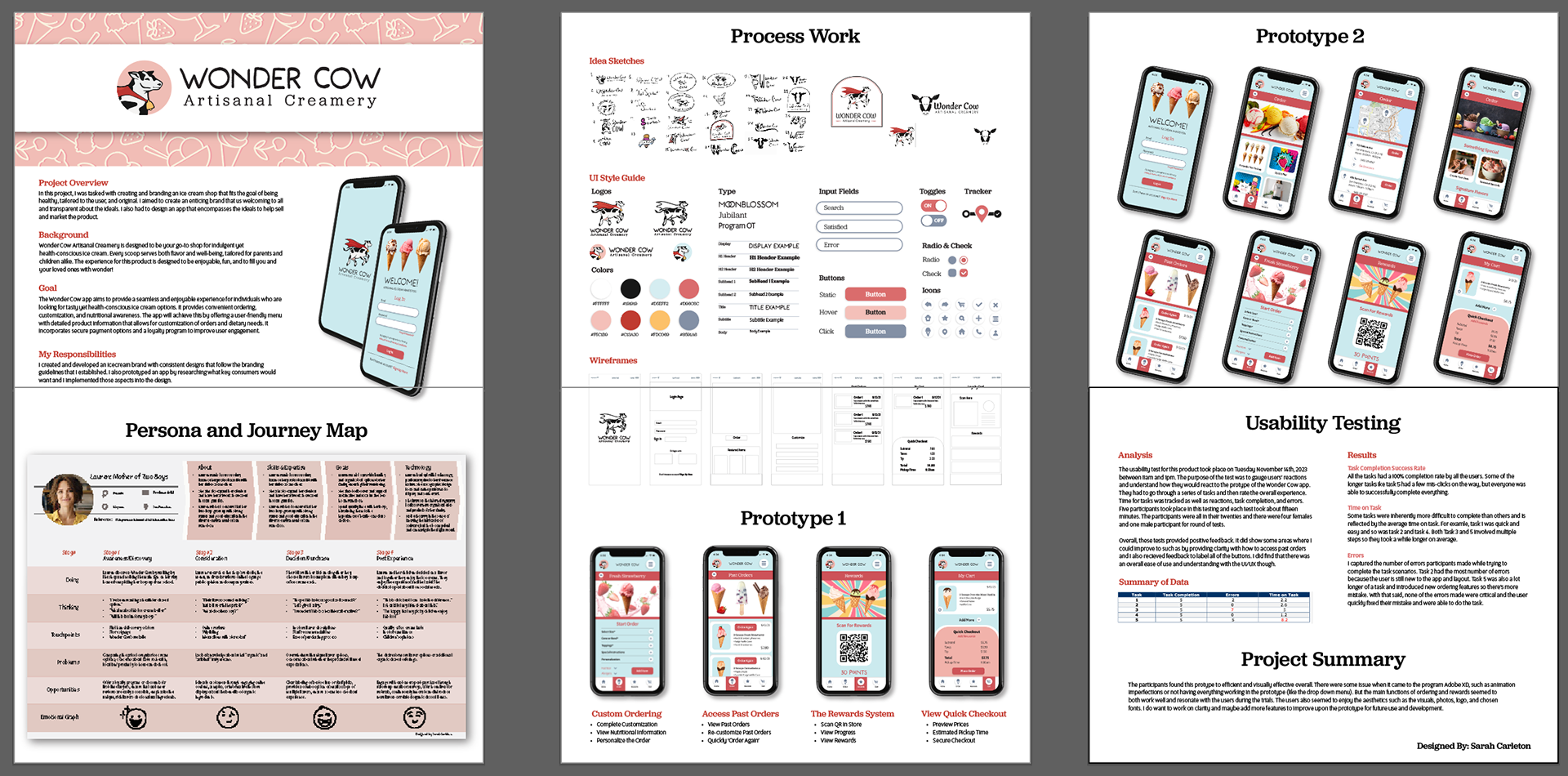
Above is a combined persona and user journey map that I created to focus on the brand goals and user experience. I also used this to figure out which concepts the final app should have.
Research: For this project, I began with research on similar companies to help develop my ideation. I created mood boards and worked on thumbnail sketches to find my design direction. Once my concept was developed, I researched similar companies even more to find gaps in the market and to see how I could differentiate this ice cream shop. This is especially noticeable in the above user journey map and persona, where I had to figure out what I wanted the main goals to be and how to convey them.
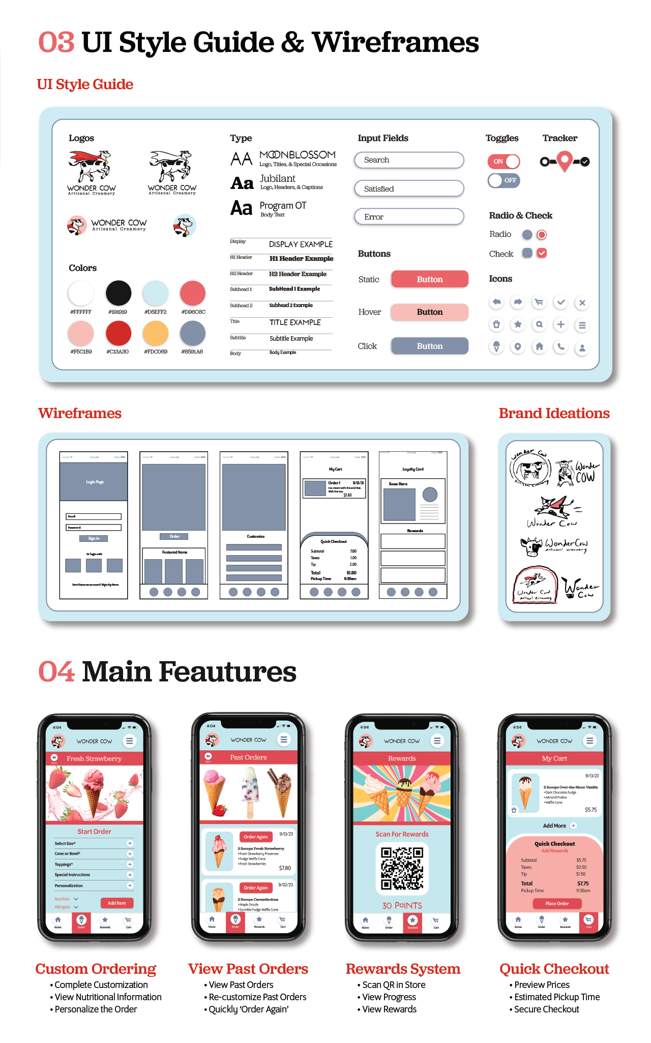
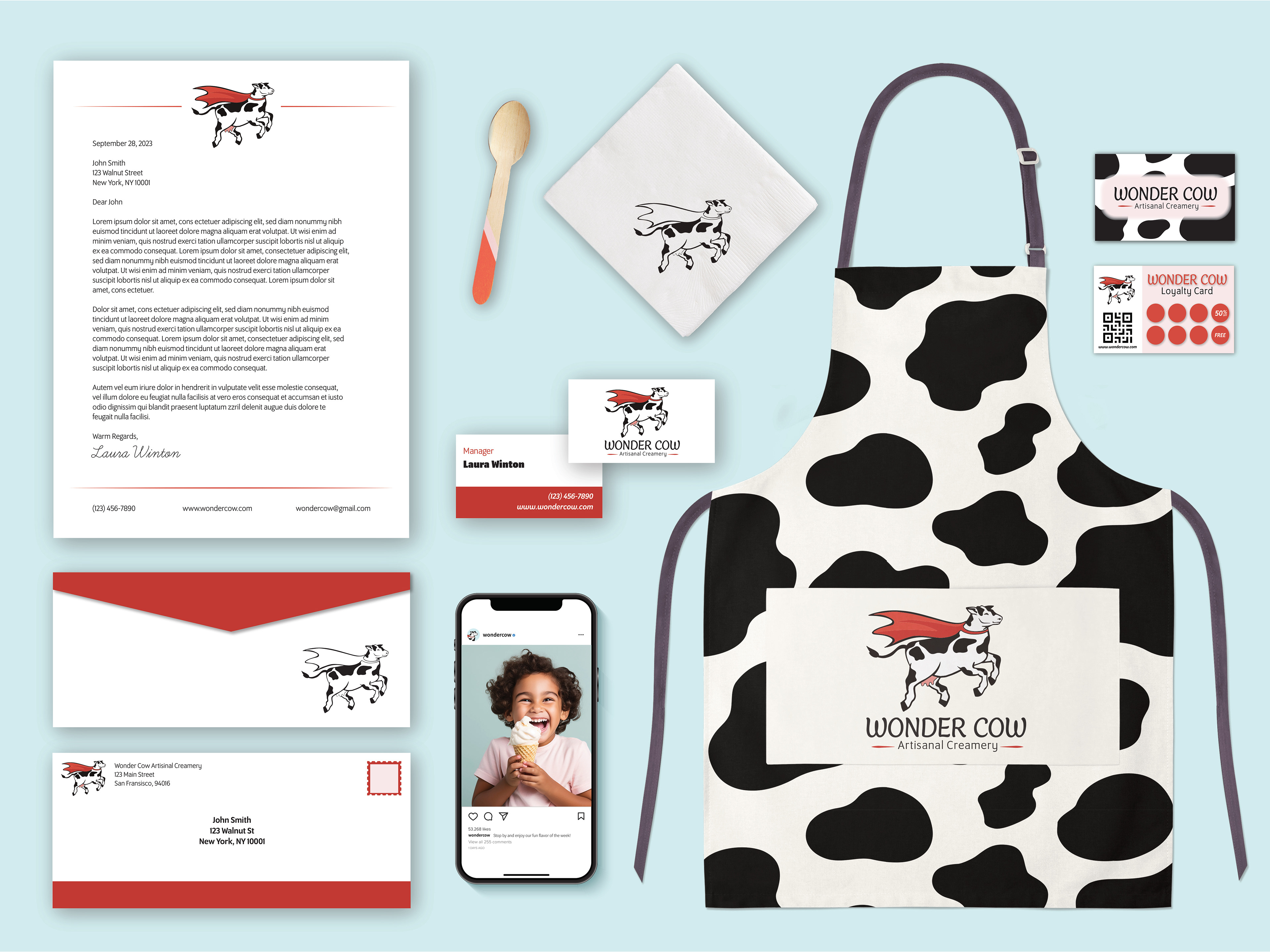
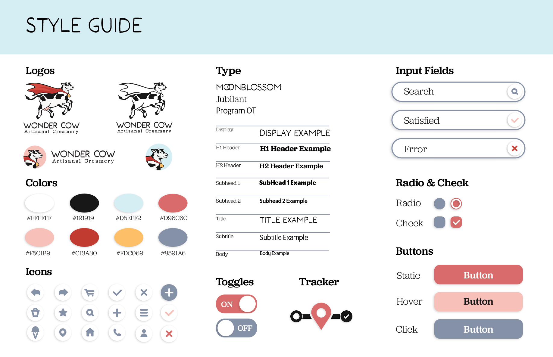
Furthermore, I spent hours looking at different apps and finding ways to keep a consistent and original feel to the app that I'm prototyping. In the below style guide and design brief, I worked on developing consistency across key messages of the company and design elements such as icons, input fields, buttons, and more.

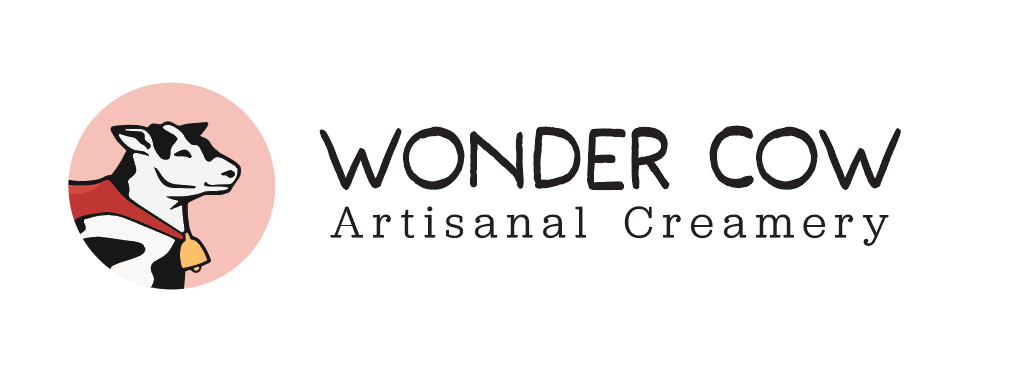
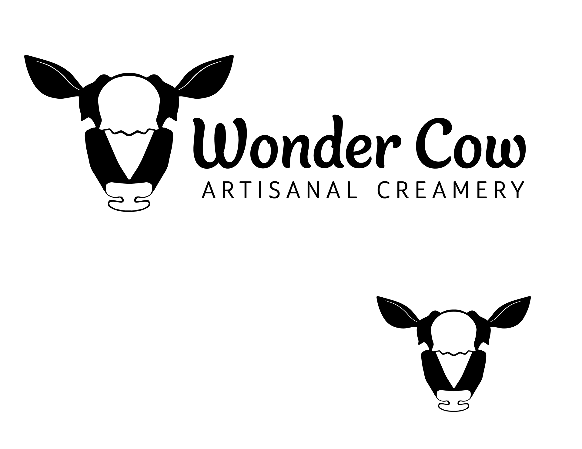
At this point, I reworked the initial log that I made. I realized that there were parts that I found to not work for me so I changed the typography and the artwork slightly. I had to improvise to make a stronger design, but I felt like it ultimately work better in the different formatting of logo that I began developing.
Challenges: One big blocker that I had during this project was something that any designer is familiar with: multitasking and time management. During this branding development, I had many other projects going on, so I had to find a good balance between all of my projects.
Learnings: With that said, I felt like I grew a lot as a designer as I focused on allocating time properly between different projects. I had to be conscientious to make sure I was being diligent with using shortcuts within the programs to be speedy and thorough. For example, I made use of the alignment tools and libraries function in Adobe Illustrator to quickly color and correctly align and space certain elements. Overall, it was good to work on my multitasking skills to further my adaptability and efficiency.
This is a quick ad intended for social media for the app.
Above: Early draft of the final posters
Below: Final posters for this project