
Has Beans Branding Redesign
Problem: Redesign the logo and branding for Has Beans Coffee & Tea, a coffee shop in the college town of Chico, California, to better compete with other coffee shops in the vicinity. Keep elements of the old brand, but refresh the branding with a modern twist that will draw in a younger generation of clients.
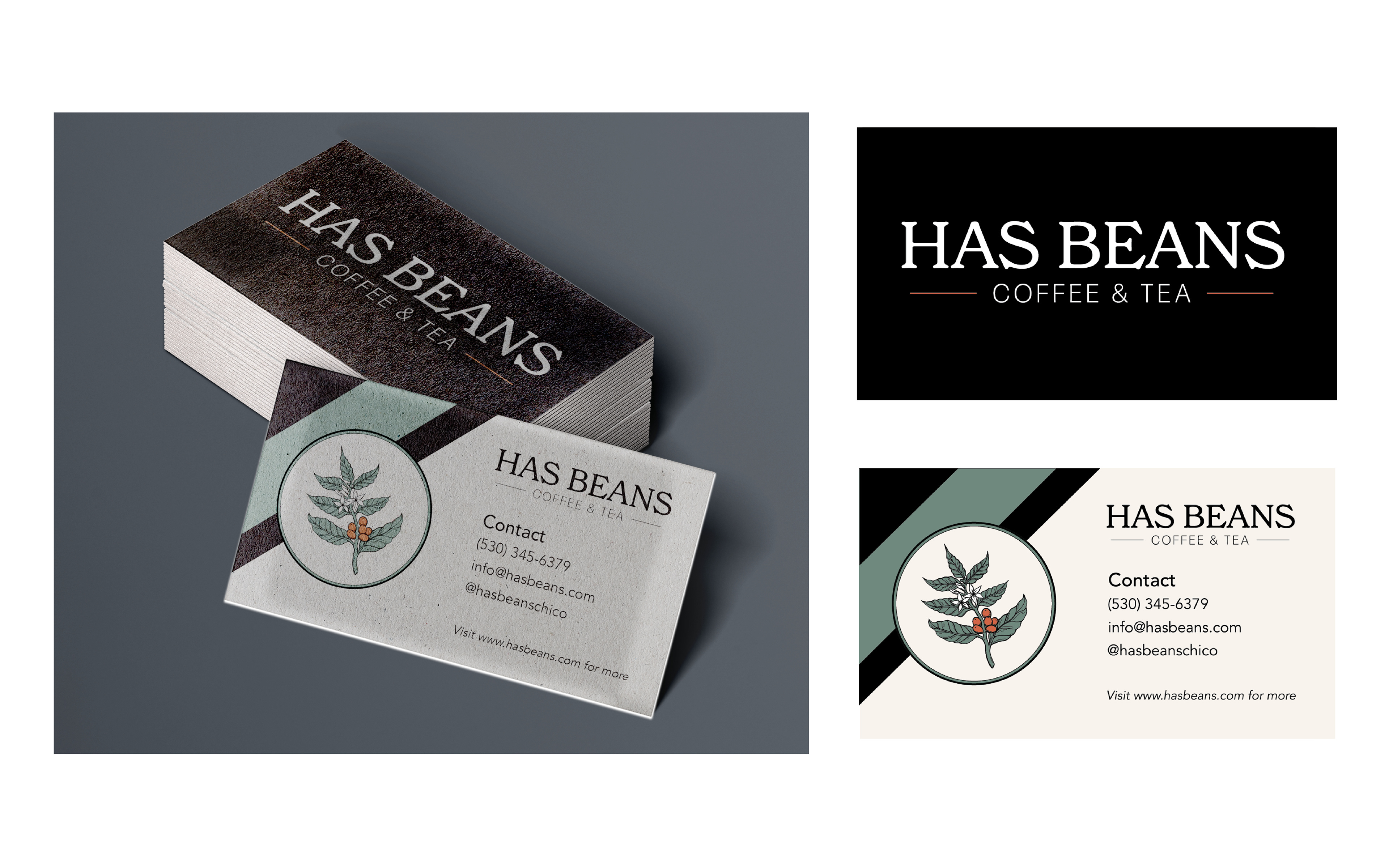
Solution: In order to modernize the branding, I made a few big changes. I utilized an arch shape for the main logo, using muted yet compelling colors that reference the old color palette without looking dated or “Christmas-y”, and creating a vectorized image of a cascara coffee branch that feels hand-drawn yet less like an olive branch like in the original logo. I also changed the font to New Spirit, which is a more modern-looking transitional serif. To keep some of the heritage and tradition present in the old logo, I kept that established date and the underhanging “H” and “S” in “Has Beans” and kept the overall vibe similar so existing customers would still recognize and feel attached to the branding.
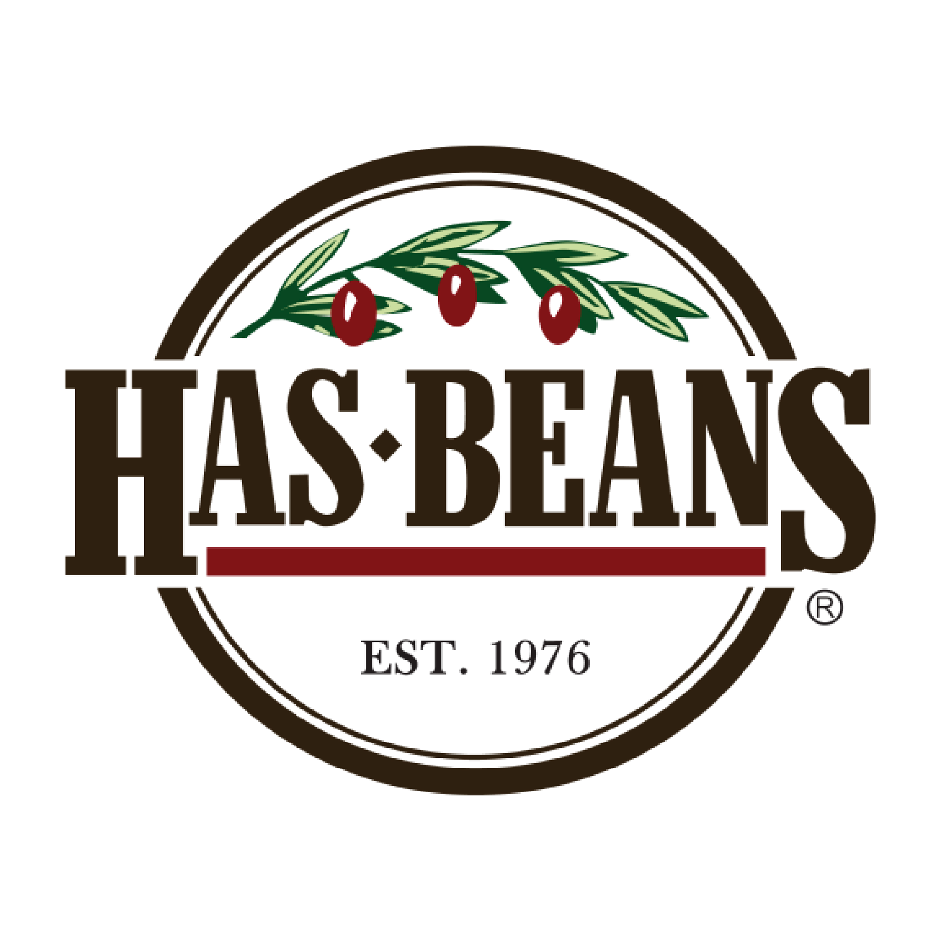
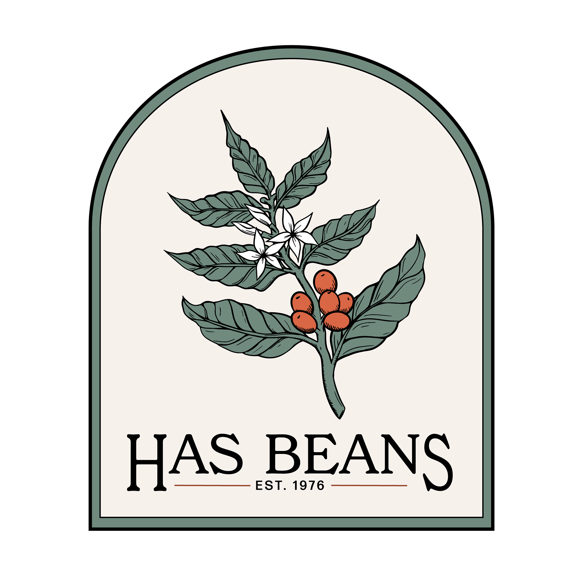
The original logo is to the left, and my logo redesign is to the right.
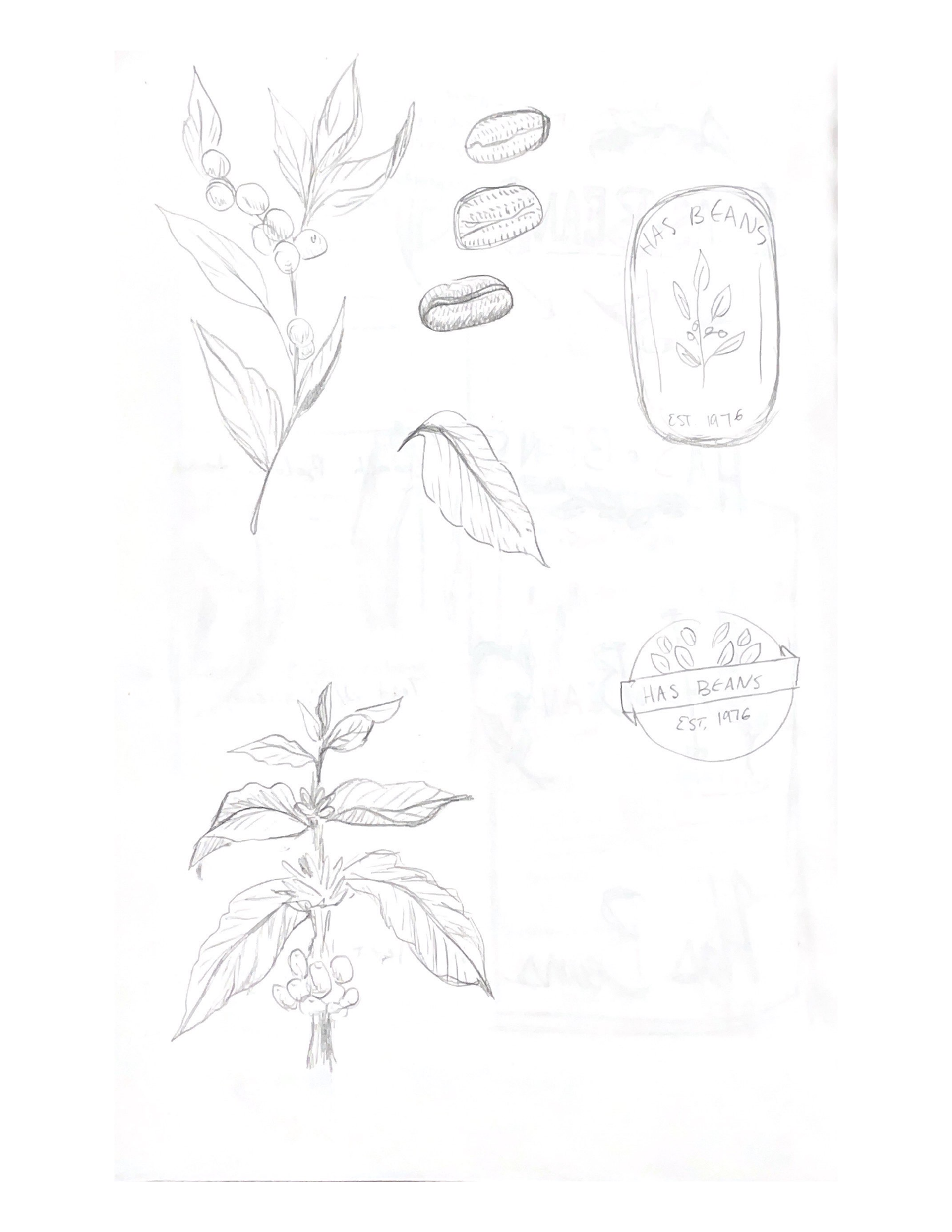
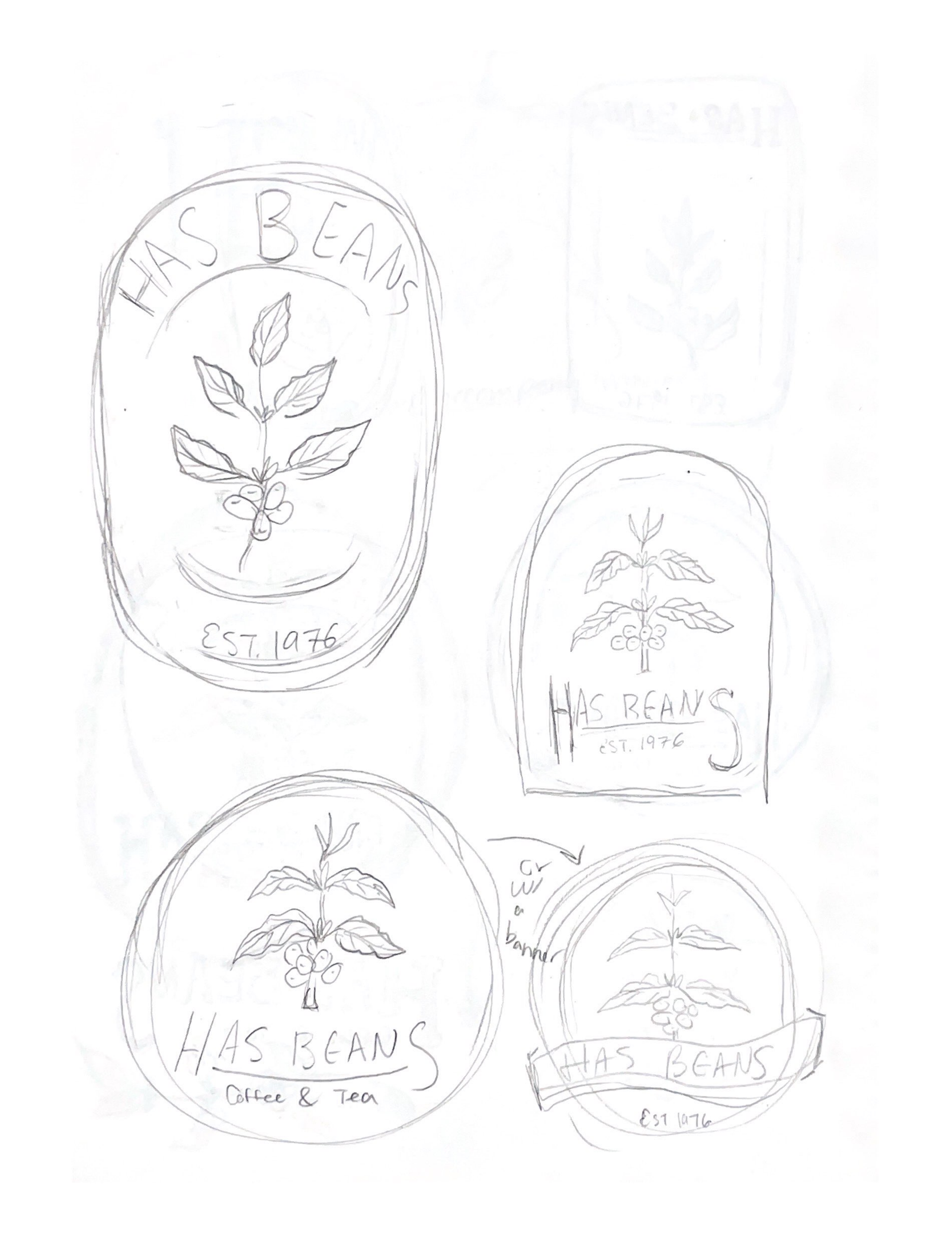
Here are some sketches that ultimately inspired my design and some of the thumbnail sketches I utilized.
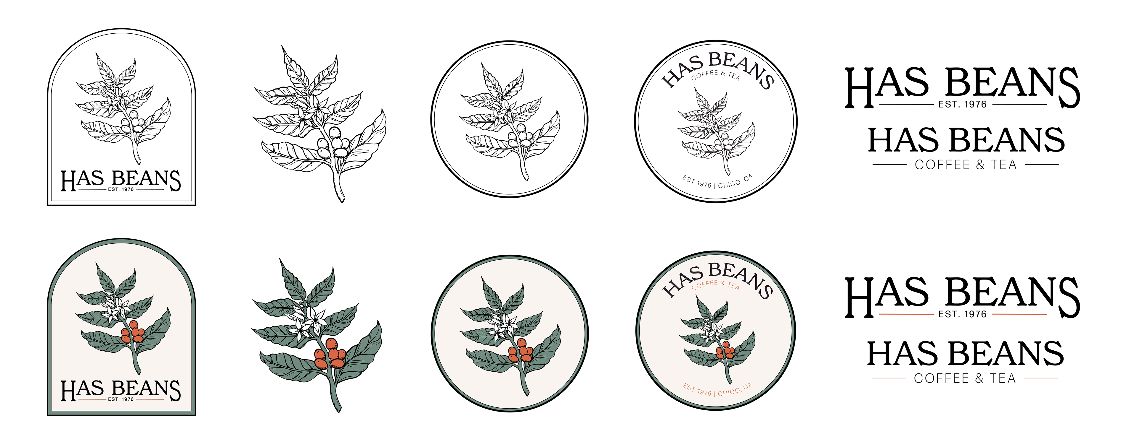
Logo Variations in Black & White and Color (Main, Logo Mark, Icons, Text Only)
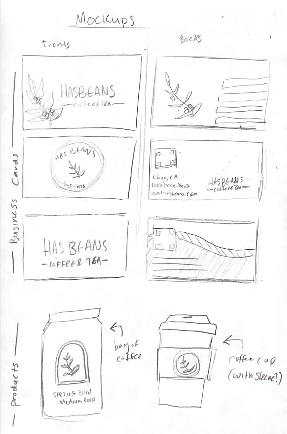

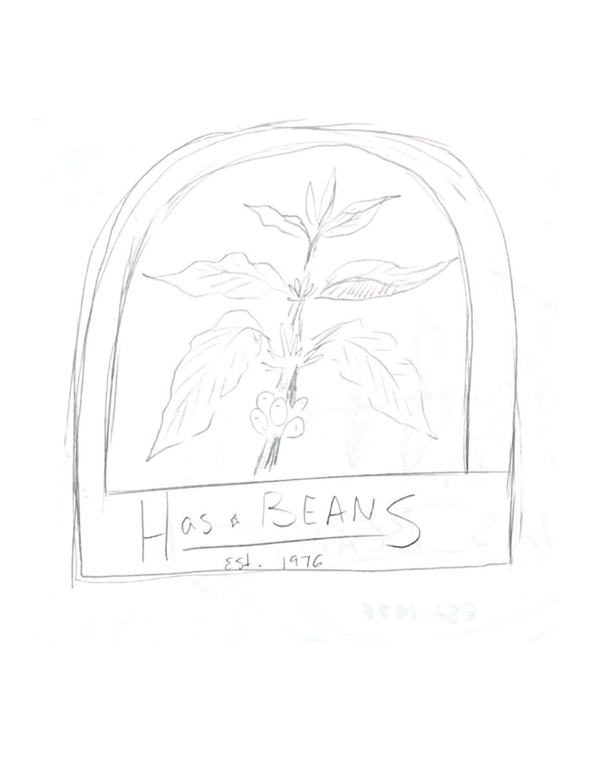
These are some mockup sketches for the brand.
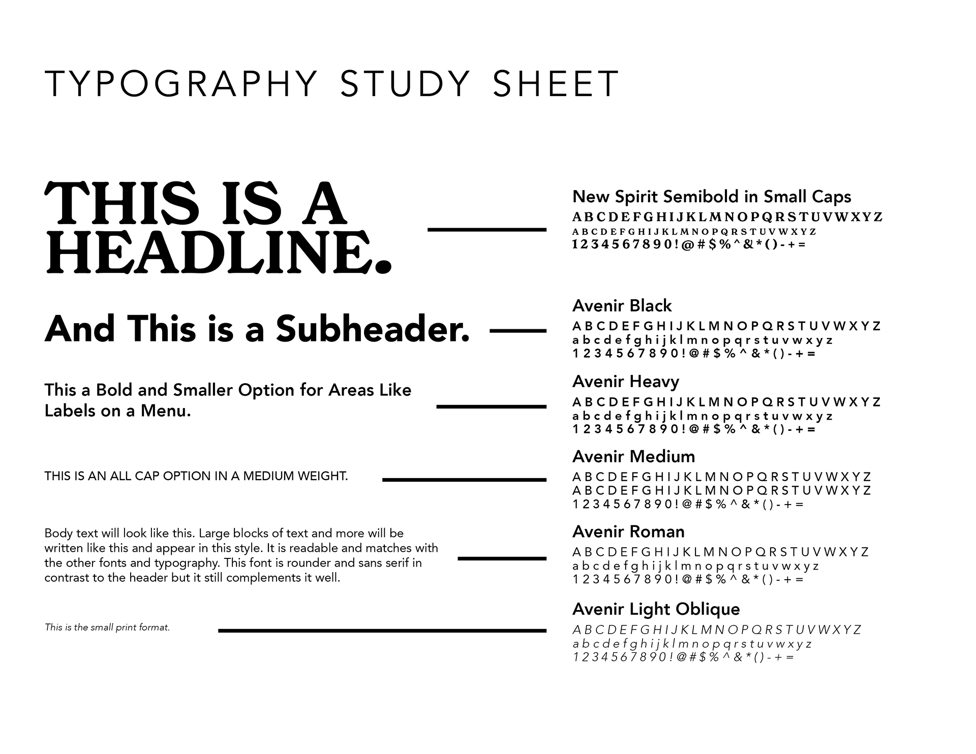
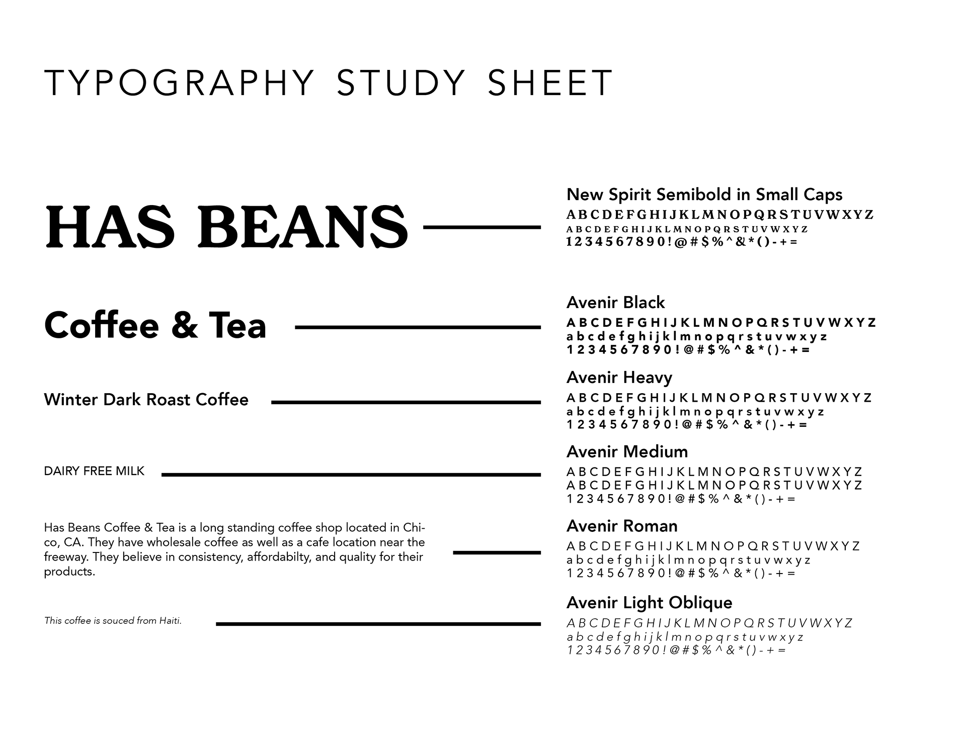
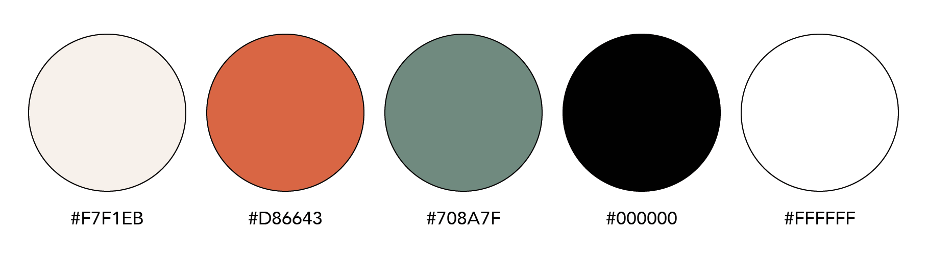
Typography and color palette for the brand.
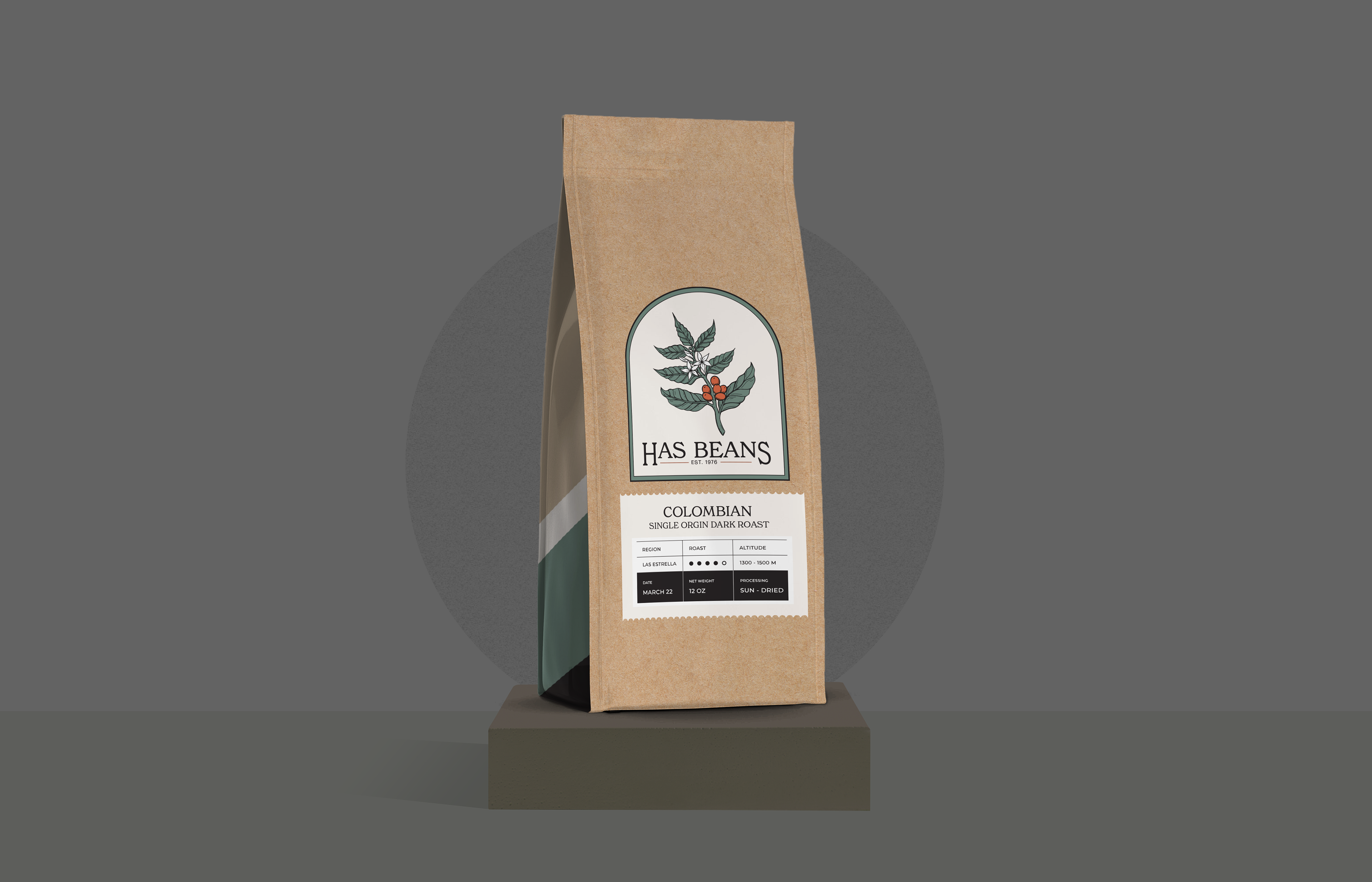
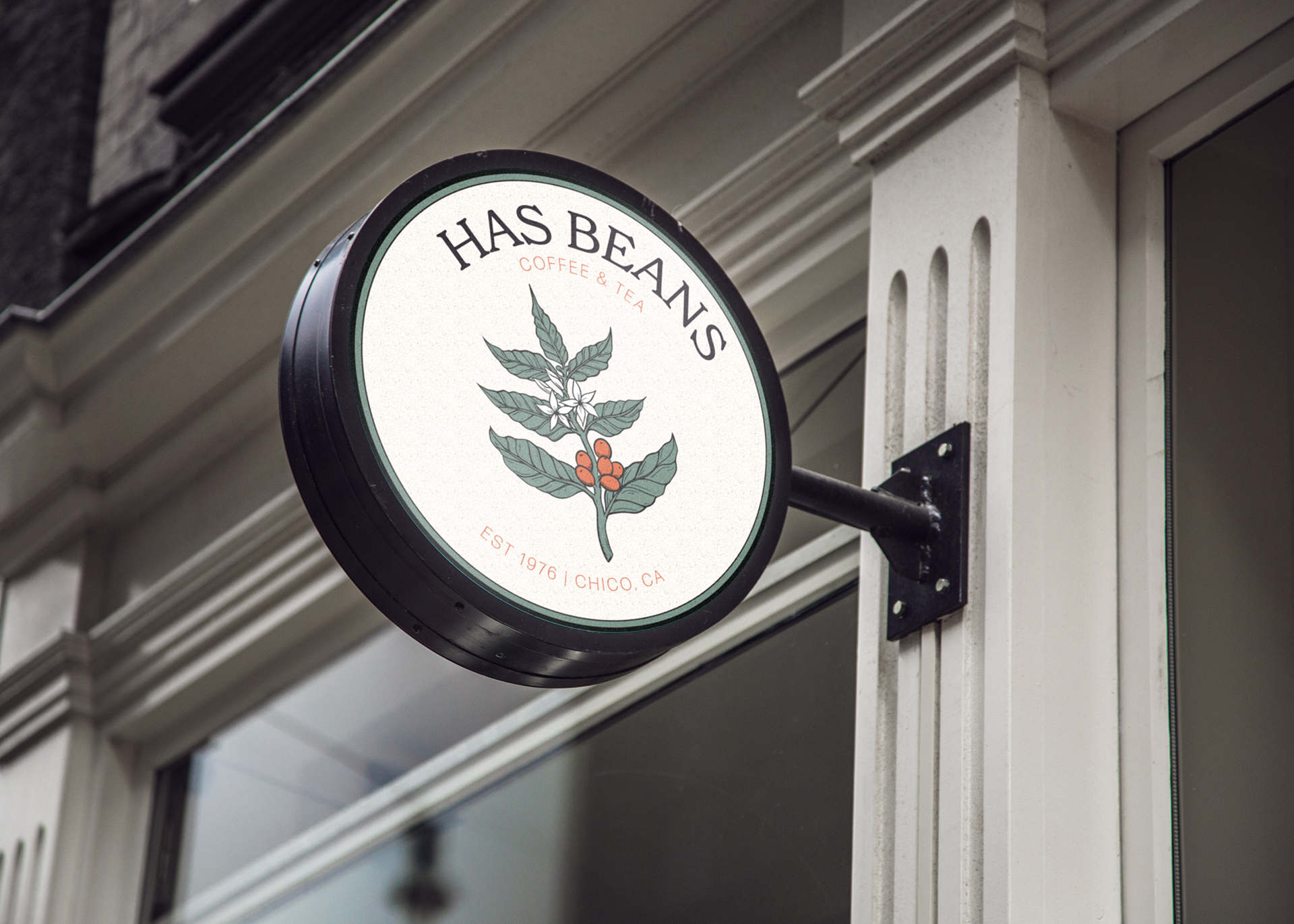
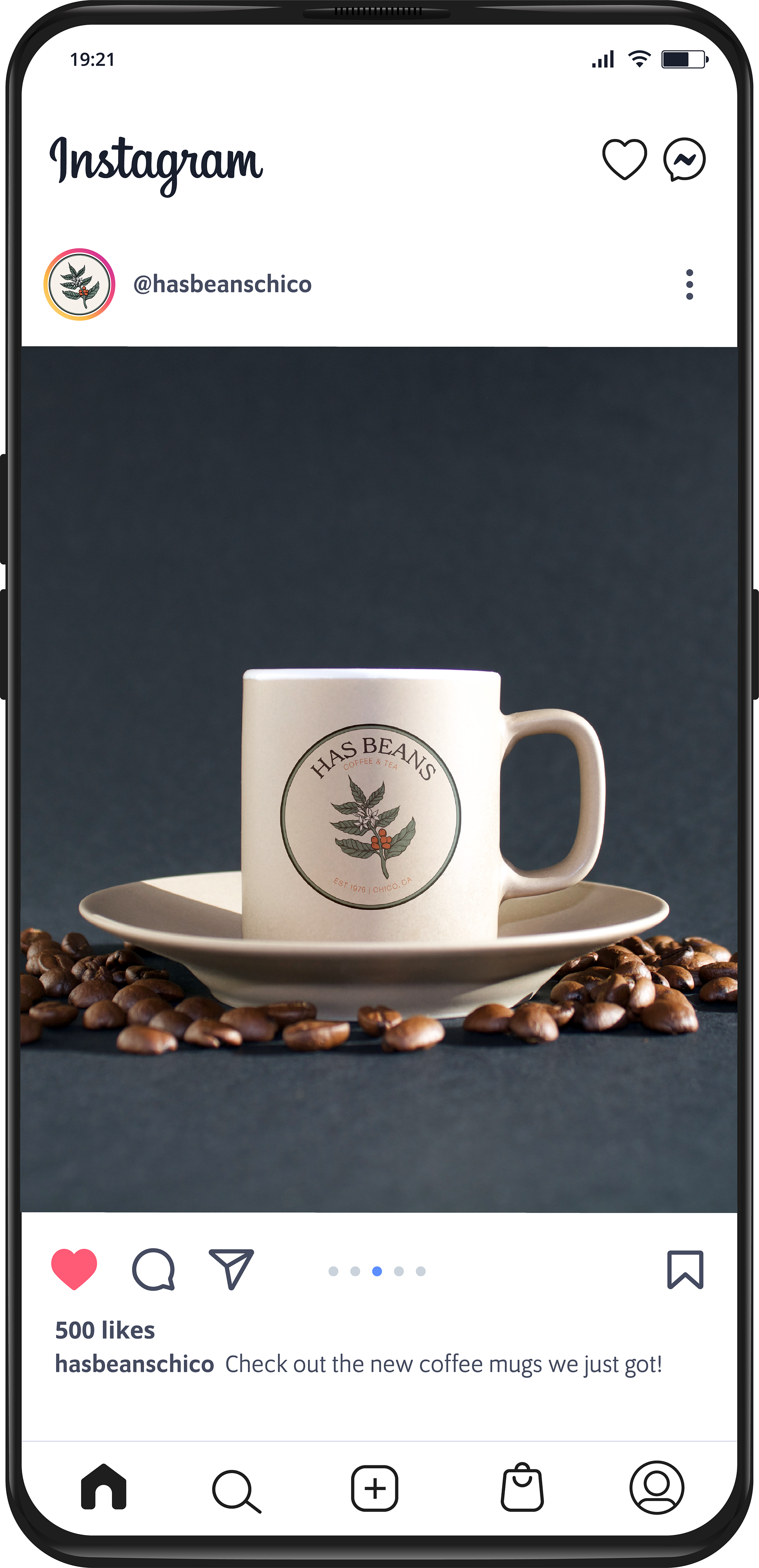
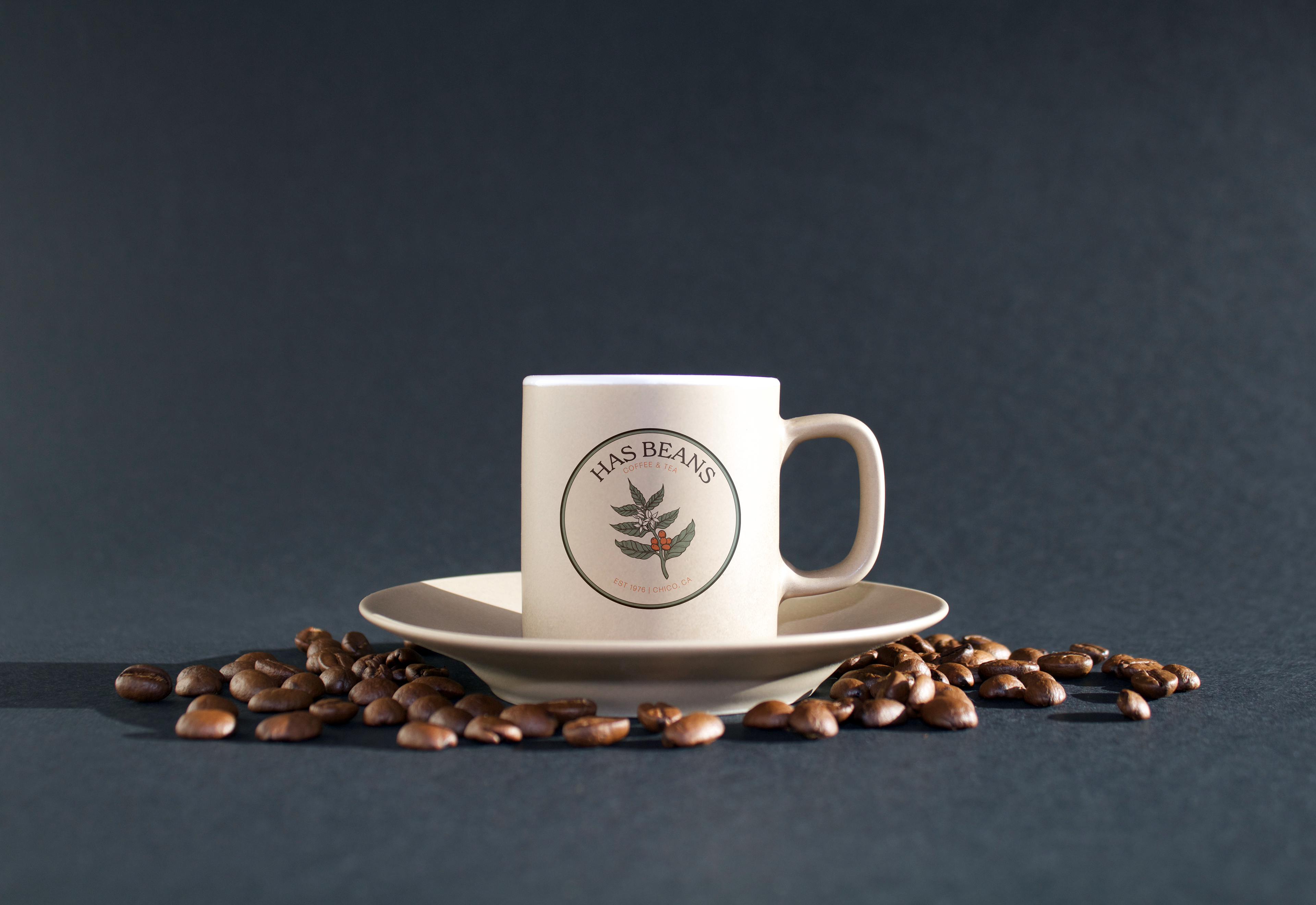
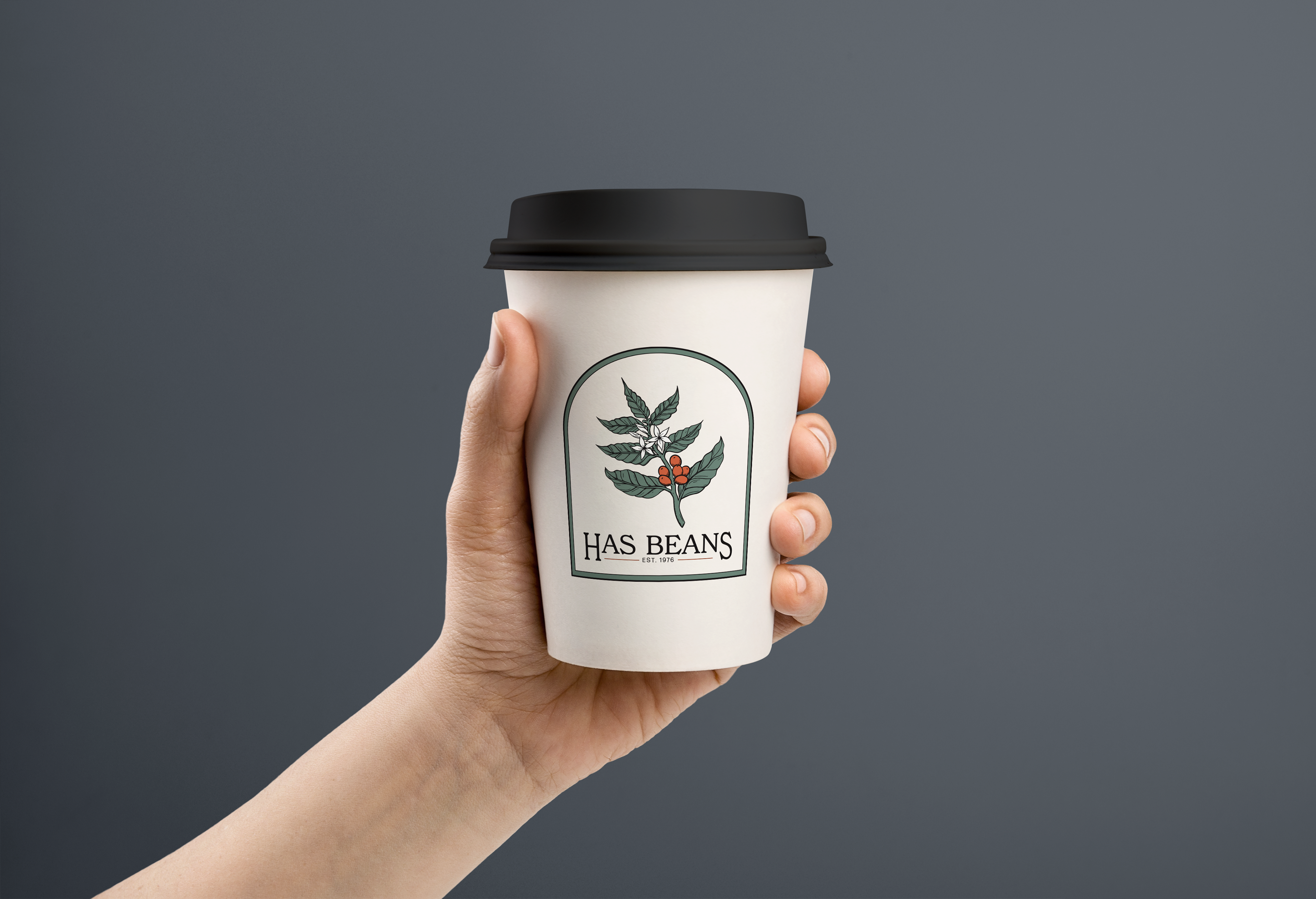
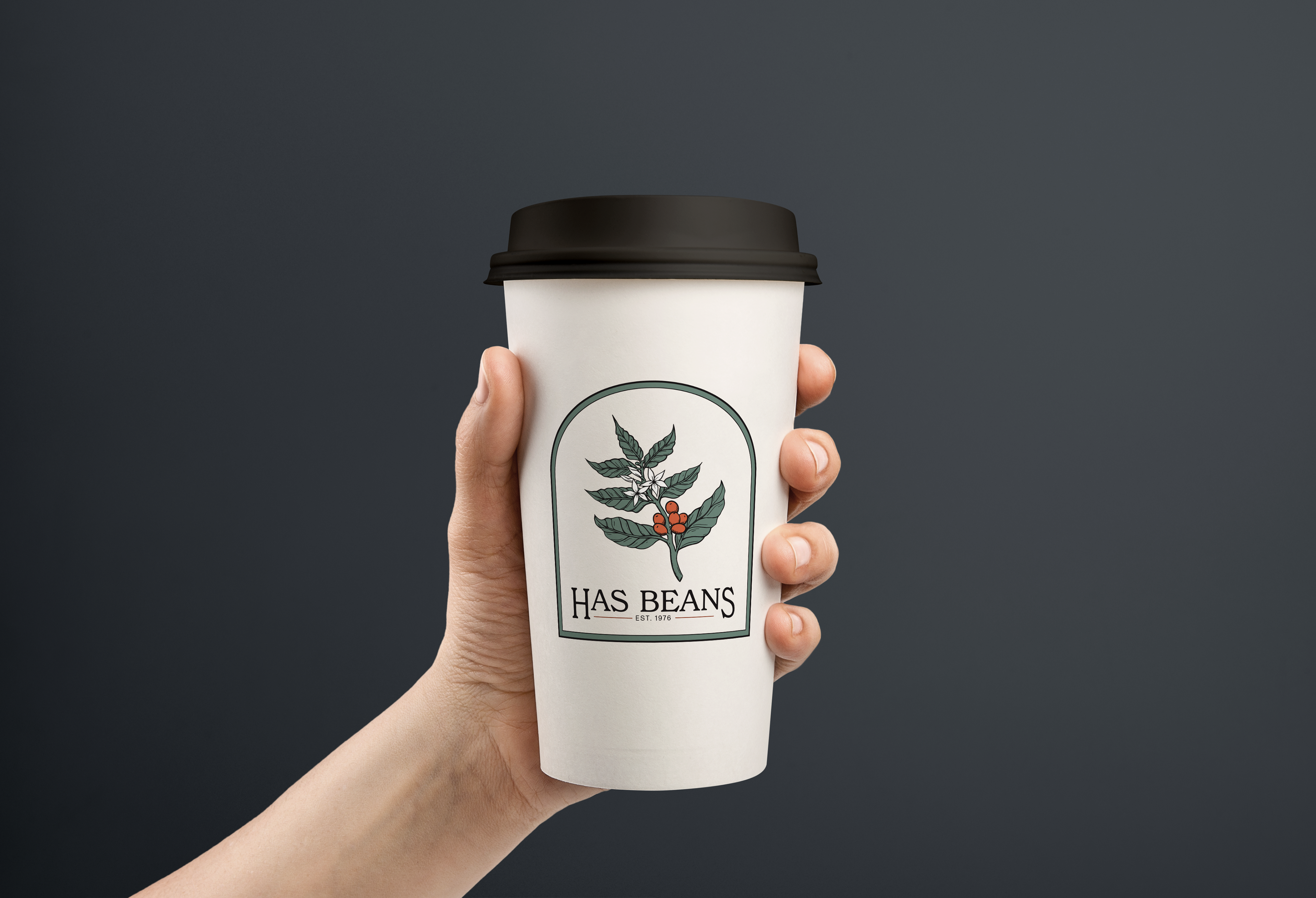
Above are some product mockups with the branding applied.